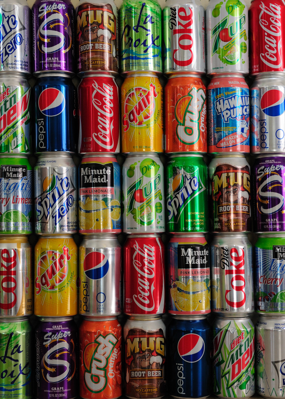
For next week's Arts Night at school, my friend Jill is putting together several displays outlining the use of graphic design and art in marketing materials. One example - designs on a soda can.

Which designs stand out the most? For me, the Classic one - The bright red Coke can.

While Coke is a classic, I also think the Mug design stands out. Nice work!
ReplyDelete